

Formerly known as Android Market, Google Play is great overall. The reason why we all love the PlayStore is that all our favorite apps and games are just some install permissions away. It also makes browsing apps easier as you dont have to browse them from the device. You can simply browse the apps on your desktop’s larger screen estate and install them. The browsing experience is much better than the iOS store which is trapped on the iDevices.
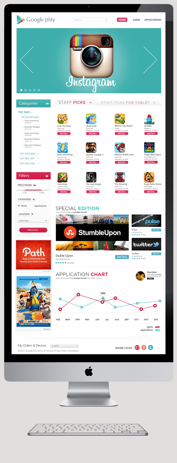
However one thing that’s always bugged me is the design of the Play Store. Sure it’s not hideous but it could look a lot better. Google, the web experts, the people who make absolutely stunning apps for both Android and iOS, haven’t put much design effort into the second biggest app store in the world. The user experience though is amazing, like most Google services.
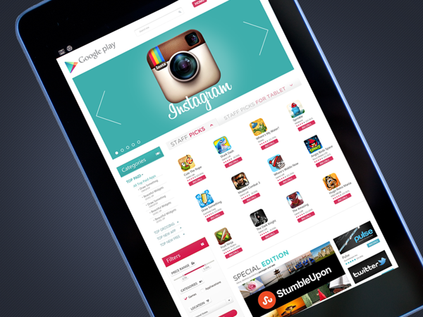
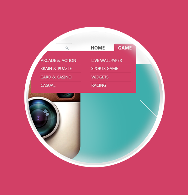
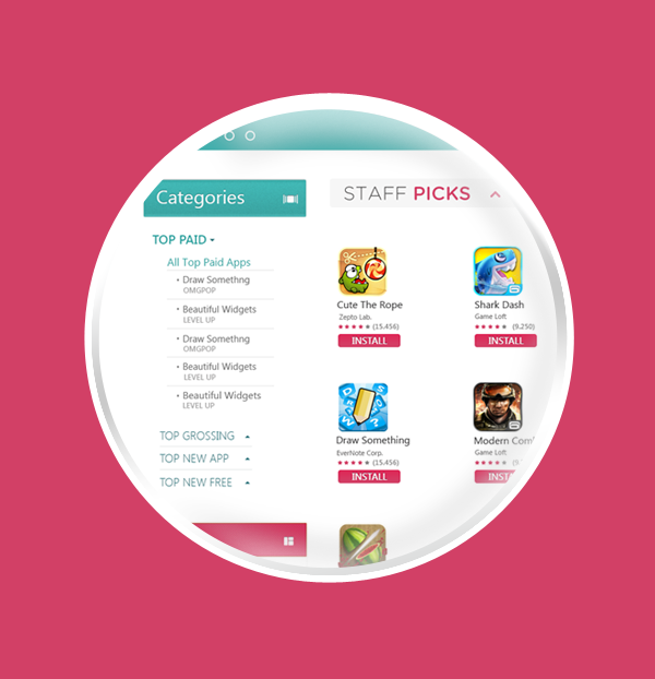
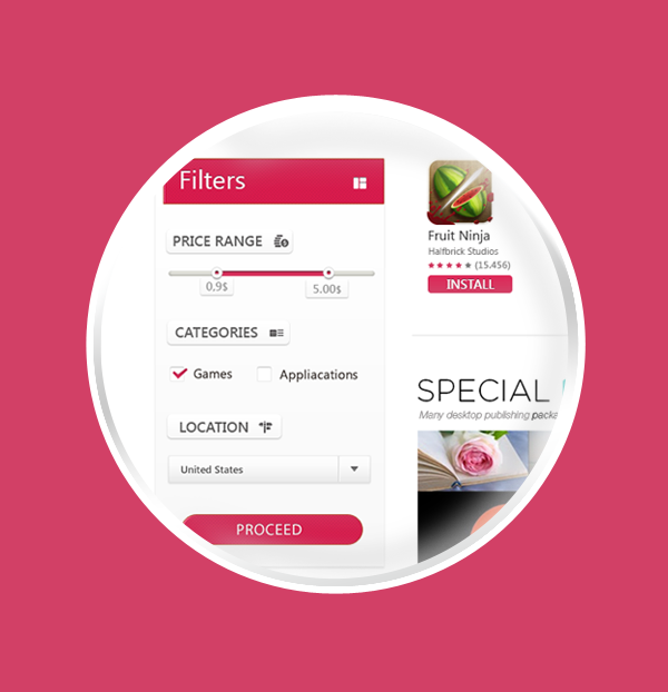
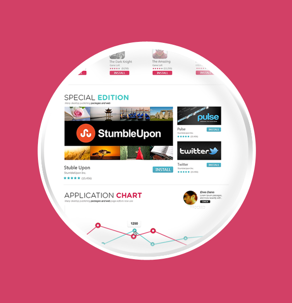
Enes Dani? agrees with us and obviously thought the same. So in his free time he came up with a random concept that keeps most of the elements of the original design but makes it a lot prettier and professional. Of course with this being an experimental concept, things are far from perfect. Though the vision is there, that’s the main thing. Check out the concept below.
Do tell us if you like this concept in the comment section below.